Your Real Odds of Dying From COVID-19 in the U.S.
Contents
Your Real Odds of Dying From COVID-19 in the U.S.#
A series of simple charts that attempt to put your risk of dying from COVID-19 in context, no matter what your age.
You may be surprised.
Tip
Feeling impatient? Jump straight to the charts. 📊📈📉
Last updated: 2022 Sep 21
Introduction#
In mid-2021, the vaccines for COVID-19 were still relatively new, and many of my friends were much more worried about the risk from the vaccines than the risk from COVID.
As people in their 30s and 40s (and even 50s and 60s), they insisted that COVID was mainly a threat to “old people”, while an “unknown” vaccine might be far more dangerous to their own young bodies, not to mention their innocent children.
They said over and over again that COVID was basically the flu, that the whole “pandemic” was a wild exaggeration, that the only people dying were the old and sick who’d have died soon anyway.
These are rather extravagant claims. Shouldn’t they be fairly easy to check?
Research Questions#
We have the statistics for COVID-19 deaths in the United States. We can pose simple questions, asking how COVID-19 deaths compare to:
Flu deaths in recent years
Other mass casualties in U.S. history
Other causes of death, broken down by age bracket
These are simple questions, with simple answers. Answers that can be best expressed in basic bar charts.
Motivation#
Yet, to my surprise, when I searched in mid-2021, I could not find this information presented anywhere, at least not all in one place.
This is a problem. We can only make sense of numbers, especially large numbers, by comparison.
People like my friends seemed to assess their COVID-19 risk by a single anchor: the extreme death toll for the extreme elderly. That was the biggest number in their minds, and to “calculate” their own risk, they counted down from there.
But these same friends would put a great deal of effort into avoiding products that might cause cancer, or unhealthy diets that might lead to heart attacks. Why? Isn’t it true that these risks would be much worse when they reached their 80s? Why worry about them now?
Clearly, many adults see heart disease and cancer in a very different context. The risk of dying at all at their age gets their attention.
In the charts that follow, I compare COVID-19 deaths in the U.S. to these and other causes of death. When you put COVID-19 deaths in this context, the risk feels quite different than when your operating assumption is, “I’m younger than 80, so I’ll probably be fine.”
Will These Charts Actually Change Anyone’s Mind?#
That said, let’s be honest: I don’t expect to change anyone’s mind with a simple series of charts.
For the vaccine skeptic, this data is untrustworthy at every level.
Are all these reported “COVID deaths” really due to COVID-19?
Even if they are, how can we be sure that a “new” vaccine technology will not lead to far more dire consequences, up to and including the end of civilization? These meta questions are larger than any “untrusted” datasets can answer.
Adapted From a Larger Project: “The Vaccine Show!”#
So my original project was much more ambitious: an interactive “game” (using Twine/Twee and SugarCube) about a made-up game show called, yes, The Vaccine Show!
Fig. 1 The Vaccine Show!#
With so many possible objections to the vaccine, an article or book seemed too linear. By contrast, this interactive format lets the reader explore their own objections.

With each choice, the reader can encounter more evidence tailored to their own concerns.
For instance, if you click the question of whether COVID was really an emergency, you soon come to this:
It’s a pretty neat format.
See also
For the full (though unfinished) game experience, see The Vaccine Show!
But one downside is that all this information is buried in the labrynthine choice paths of the game.
In this notebook, we’ll extract the key charts for easier consumption.
Important
Even if you fully accept mainstream science and have no qualms about vaccines, this data may still startle you.
Consider this: in the first year of the pandemic, was COVID-19 was in the top ten leading causes of death for Americans in their thirties? How about the top five?
Read on to find out.
Note
Although these charts are as accurate and useful as I could make them, see below for important caveats.
Setup#
library(ggplot2)
library(scales)
library(dplyr, warn.conflicts = FALSE)
library(readr, warn.conflicts = FALSE)
library(stringr)
library(gt)
library(gtExtras)
library(svglite)
# library(RColorBrewer)

# Updated cumulative COVID deaths
covid_deaths_updated <- "1,048,935"
covid_deaths_updated_num <- 1048935
date_updated <- "through 2022 Sep"


# REPORT DATA
# Death count for Demographic Charts

# COVID Deaths in the U.S. for First 12 months of the pandemic, through 2021 Feb.
covid_deaths_first_year <- "527,587"
covid_deaths_first_year_num <- 527587
date_first_year_covid <- "First Year, through 2021 Feb"

# CONFIGURATION

# Make plots wider
options(repr.plot.width=15, repr.plot.height=10)
color_bar <- "red"
color_bar_gradient2 <- "orange"
color_bar_nomatch <- "gray"
color_covid_row <- "pink"
# covid_match_str <- "⮞⮞ COVID-19 ⮜⮜"
covid_match_str <- "COVID-19"
Helper Functions#
theme_vaccine <- function() {
  theme_gray(
    base_size = 20,
  ) %+replace%
  theme(
    plot.title = element_text(
      size = 24,
      margin = margin(10,0,10,0),
      hjust = 0.5,
      face = "bold"),
    plot.subtitle = element_text(
      margin = margin(00,0,10,0),
      lineheight = 34,
      hjust = 0.5
    ),
    plot.caption = element_text(
      size = 14,
      hjust = 0.5,
      margin = margin(10,0,5,0),
      color = "#777777"),
    axis.text.x=element_text(
      angle=45,
      hjust = 1,
      vjust = 1,
      margin = margin(t=5, b=25)
    ),
    legend.title = element_text(size = 14),
    legend.text = element_text(size = 14),
    legend.key.size = unit(1, "cm")
  )
}


hide_grid_x <- function() {
  theme(
    panel.grid.major.x = element_blank(),
    panel.grid.minor.x = element_blank(),
  )
}


hide_grid_y <- function() {
  theme(
    panel.grid.major.y = element_blank(),
    panel.grid.minor.y = element_blank(),
  )
}


bar_format <- function(
                       gradient = TRUE,
                       gradient_low = "yellow",
                       gradient_high = "red",
                        coord_flip = TRUE,
                       scale_y_continuous = TRUE,
                       stat = "identity",
                        hide_axis_x = FALSE,
                        hide_legend = FALSE
                       ) {
  list(
    geom_bar(stat=stat),
    # theme_vaccine must precede later theme() items.
    theme_vaccine(),
    if (gradient) {
        scale_fill_gradient(
            labels = comma,
            low = gradient_low,
            high = gradient_high
        )
    },
    if (coord_flip) {
        coord_flip()
    },
    # coord_flip also determines hide_grid_x, hide_grid_y
    if (coord_flip) {
        hide_grid_y()
    } else {
        hide_grid_x()
    },
    if (scale_y_continuous) {
        scale_y_continuous(labels = comma)
    },
    if (hide_axis_x) {
        theme(
            axis.ticks.x=element_blank(),
            axis.text.x=element_blank()
            )
    },
    if (hide_legend) {
        theme(legend.position = "none")
    }
  )
}


show_date_updated <- function(use_date_updated=FALSE) {
    if (use_date_updated) {
        use_date = date_updated
    } else {
        use_date = date_first_year_covid
    }
    paste("(", use_date, ")", sep="")
}


caption_default <- function(
    source,
    plural=FALSE
    ) {
    if (plural) {
        caption_prepend="Sources:"
    } else {
        caption_prepend="Source:"
    }
    caption_append="(vaccineshow.billalive.com)"
    paste(caption_prepend, source, caption_append)
}


prep_table <- function(data,
                       title,
                       col_arrange='',
                       subtitle='',
                       col_number='') {
    data %>%
    gt() %>%
    gt_theme_538() %>%
    opt_row_striping() %>%
    {
        if (subtitle != '') {
          tab_header(., title = title, subtitle = subtitle)
        } else {
          tab_header(., title = title)
        }
    } %>%
    {
        if (col_number != '') {
          fmt_number(., columns = all_of(col_number), decimals = 0)
        } else { . }
    }
}


get_covid_row <- function(data, col,
                          arg_covid_match_str=covid_match_str) {
    which(str_detect(data[[col]], arg_covid_match_str))
}


get_covid_bar_color <- function(table, col,
                        arg_covid_match_str=covid_match_str,
                        arg_color_bar=color_bar,
                        arg_color_bar_nomatch=color_bar_nomatch) {
    ifelse(
        str_detect(gt_index(table, col), arg_covid_match_str),
        color_bar, color_bar_nomatch
    )
}

show_table <- function(table) {
    gt:::as.tags.gt_tbl(table)
}


title_ages_vs_leading_cause <- function(ages) {
    paste("Ages ", ages, ": Causes of Death",
         sep="")
    }


show_table_covid_vs_other <- function(data, col_label) {
    # Note that gt_plt_bar() requires column name to NOT
    # be surrounded by quotes.
    show_table(prep_table(data, title,
                      subtitle=subtitle, col_number="Deaths") %>%
    gt_highlight_rows(rows = get_covid_row(data, col_label),
                      fill = color_covid_row) %>%
    gt_plt_bar(column = Deaths,
               keep_column = TRUE,
               color = get_covid_bar_color(., col_label)))
    }
Cumulative Deaths vs. First Year of Deaths#
Important
Each chart in this report focuses on one of two different COVID-19 death totals. It’s important to understand which total you’re looking at in each chart.
These two totals are:
The cumulative death toll from COVID-19 as of my most recent update (2022 September).
The deaths from only the first year of COVID-19, through 2021 February.
When comparing COVID-19 to mass casualty events (such as the Civil War or 9/11), I have used the cumulative total for all COVID-19 deaths in the U.S thus far.
But ongoing causes of death, like the flu or cancer, are normally analyzed by year. So, for charts that compare COVID-19 deaths to ongoing causes of death, I’ve used the deaths from only the first year of the pandemic in the U.S., through 2021 February.
This might seem too simplistic, but there are other reasons for this choice, which I explain below. In particular, vaccines weren’t yet widely available. My primary goal is to persuade people to get the vaccines, so this first year of data shows what the death rates looked like when no one could get vaccinated.
Although the comparison isn’t perfect, by comparing the first year of COVID-19 deaths to our most recent “ordinary” year of deaths (2019), we can get a much better context for understanding the risks of dying from COVID-19 at younger ages.
All Death Totals in this Report are for the U.S. Only#
Note
All death totals in this report, from any cause, are from the United States. For why, see below.
If You’re Vaccinated, These Aren’t Your Odds#
Important
This report focuses on the first year of the pandemic, before vaccines were available. If you’ve kept up with your vaccines, your risks are now much, much lower.
COVID-19 vs. the Flu#
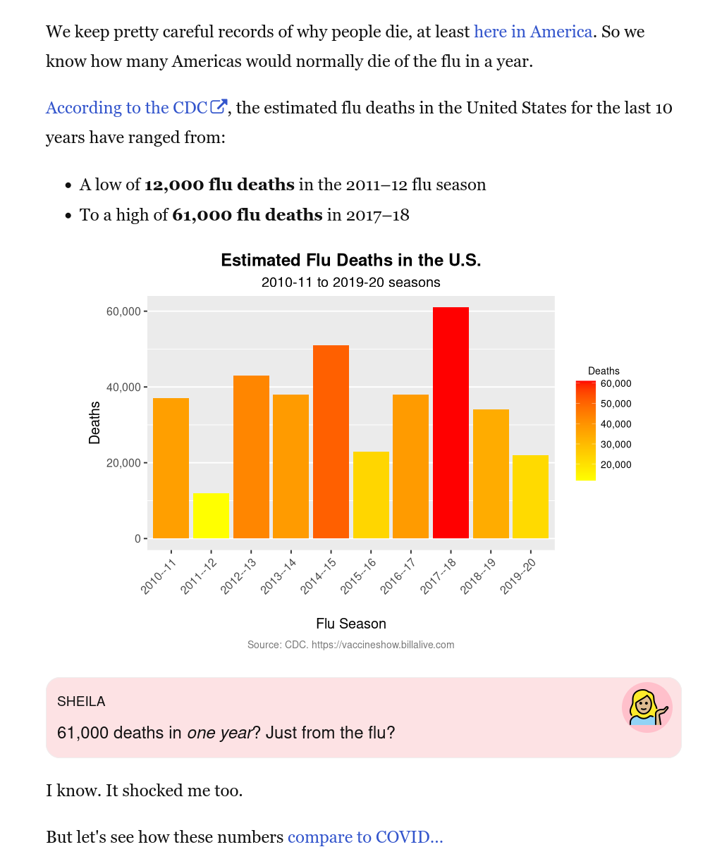
Let’s start with the flu.
In the early days, COVID-19 was often compared to the flu.
I myself was surprised to discover that in a bad year, the flu might kill 50,000 or even 60,000 people in the U.S.
The flu? Really?
Flu Deaths by Year#
title = "Flu Deaths by Year in the U.S."
subtitle = "2010-11 to 2019-20 seasons"

data <- read_csv("data/flu-deaths-us.csv", show_col_types = FALSE)
ggplot(data, aes(x=FluSeason, y=Deaths, fill=Deaths)) + geom_bar(stat="identity") +
  labs(
    title = title,
    subtitle = subtitle,
    caption = caption_default("CDC"),
    x="Flu Season",
    y="Deaths"
  ) +
bar_format(coord_flip=FALSE)
Those flu deaths look pretty bad. They are pretty bad.
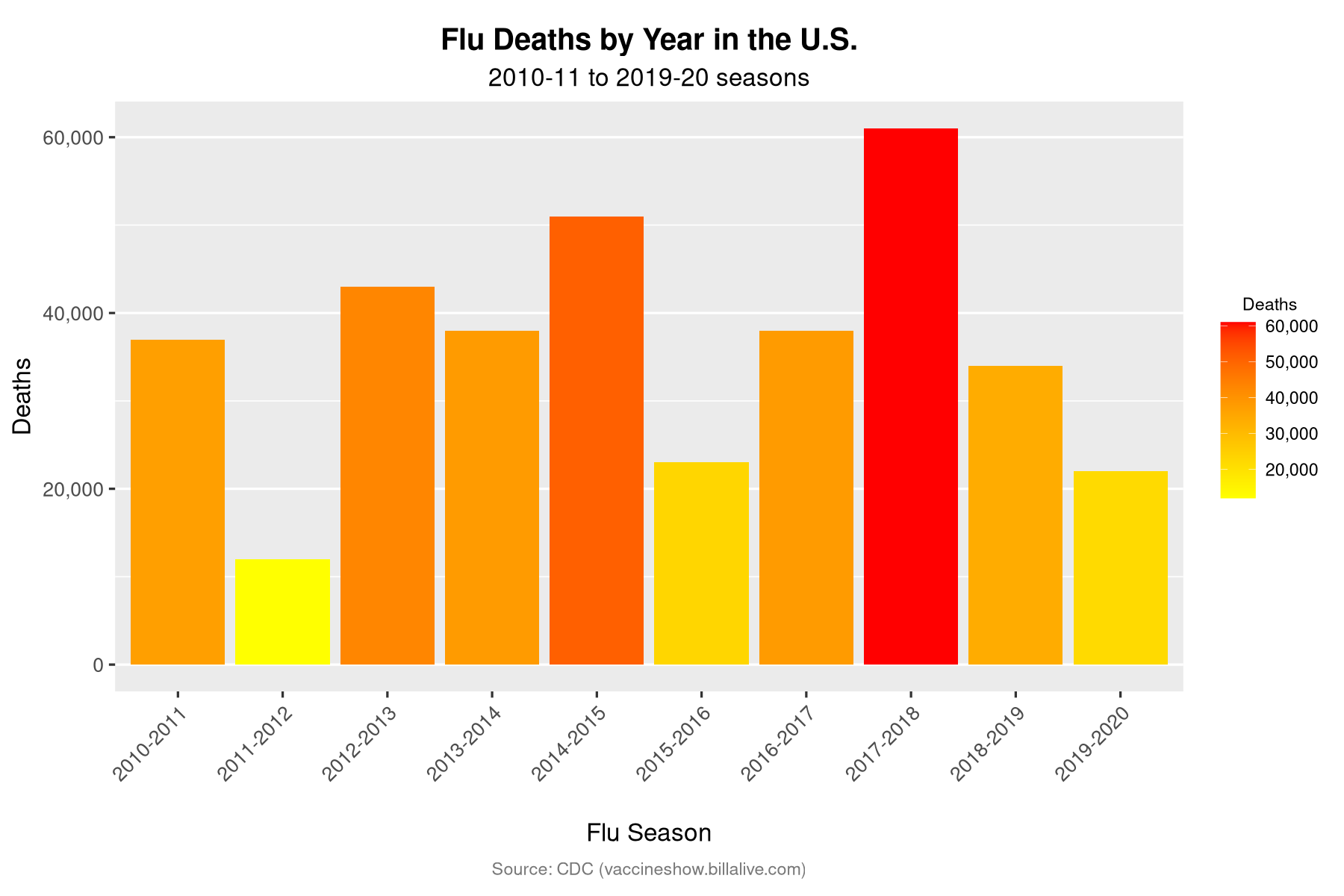
Flu Deaths vs. COVID Deaths (First Year)#
But now compare them to the first 12 months of COVID-19 deaths.
data <- read_csv("data/flu-deaths-vs-covid-usa.csv", show_col_types = FALSE)
title = paste("Flu Deaths by Year vs. COVID-19 Deaths",
              show_date_updated())
subtitle = paste("U.S. Deaths Only. COVID-19 Deaths ", show_date_updated(), ": ", covid_deaths_first_year, sep="")

ggplot(data, aes(x=FluSeason, y=Deaths, fill=Deaths)) +
  labs(
    title = title,
    subtitle = subtitle,
    caption = caption_default("CDC"),
    x="Flu Season / COVID-19 (First Year)",
    y="Deaths"
  ) +
  bar_format(coord_flip=FALSE)
Here are the numbers:
show_table(prep_table(data, title,
                      col_number="Deaths") %>%
    gt_plt_bar(
        column = Deaths,
        keep_column = TRUE,
        color = get_covid_bar_color(., "FluSeason")
    ) %>%
    cols_label(FluSeason = html("Flu Season")))
| Flu Deaths by Year vs. COVID-19 Deaths (First Year, through 2021 Feb) | ||
| Flu Season | Deaths | Deaths |
|---|---|---|
| 2010-11 | 37,000 | |
| 2011-12 | 12,000 | |
| 2012-13 | 43,000 | |
| 2013-14 | 38,000 | |
| 2014-15 | 51,000 | |
| 2015-16 | 23,000 | |
| 2016-17 | 38,000 | |
| 2017-18 | 61,000 | |
| 2018-19 | 34,000 | |
| 2019-20 | 22,000 | |
| COVID-19 (First Year) | 527,587 | |
This is what I mean by a simple chart.
For me, that skyscraper of death dwarfs all argument. No, COVID-19 is not “like the flu.”
Sources#
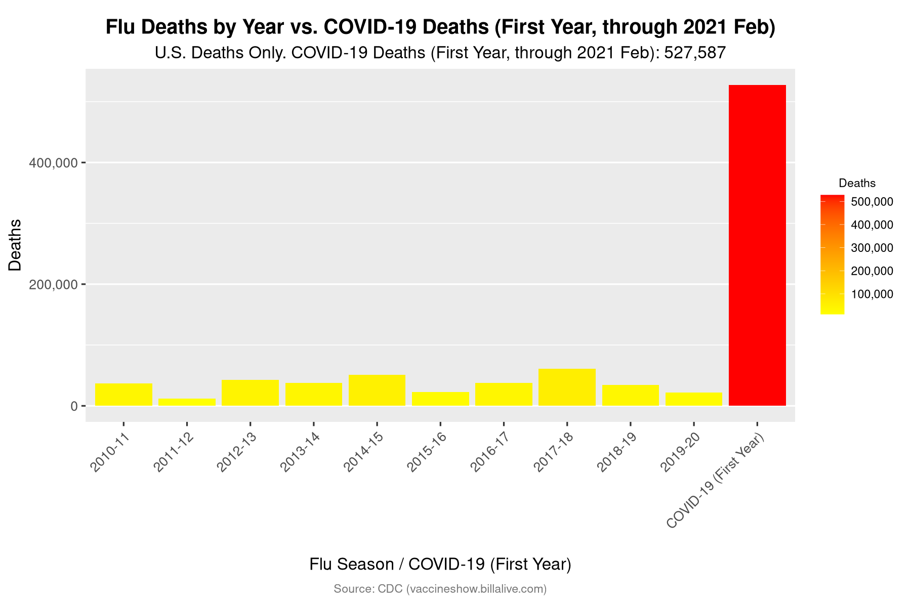
COVID-19 U.S. Deaths vs. Other U.S. Mass Casualties#
That was the death toll after the first year of COVID-19. But what about the cumulative death toll?
By now, we all know that after less than two and a half years, COVID-19 has killed over a million Americans.
How does this compare to past national tragedies in U.S. history?
For the sheer death toll, nothing comes close.
data <- read_csv("data/covid-vs-other-disasters-usa.csv",
                 show_col_types = FALSE)
title = paste("Total COVID-19 U.S. Deaths",
              show_date_updated(use_date_updated=TRUE),
              "vs. Other U.S. Mass Casualties")
subtitle = "(Wars show U.S. military deaths, including from war-related disease)"
ggplot(data, aes(x=reorder(Event, Deaths), y=Deaths, fill=Deaths)) +
  labs(
    title = title,
    # subtitle = show_date_updated(),
    caption = caption_default("CDC, Congressional Research Service, CNN, doi:10.1353/cwh.2011.0061.", plural=TRUE),
    x="",
    y="U.S. Deaths"
  ) +
  bar_format()
show_table_covid_vs_other(data, "Event")
| Total COVID-19 U.S. Deaths (through 2022 Sep) vs. Other U.S. Mass Casualties | ||
| (Wars show U.S. military deaths, including from war-related disease) | ||
| Event | Deaths | Deaths |
|---|---|---|
| COVID-19 | 1,048,935 | |
| Civil War (est.) | 752,000 | |
| 1918 Flu Pandemic | 675,000 | |
| World War II | 405,399 | |
| World War I | 116,516 | |
| 1957-58 Flu Pandemic | 116,000 | |
| 1968 Flu Pandemic | 100,000 | |
| Vietnam War | 58,220 | |
| Revolutionary War | 4,435 | |
| 9/11 attack | 2,977 | |
Sources#
Military deaths: Congressional Research Service, Updated July 29, 2020
Civil War estimate of 752,000 deaths:
“A Census-Based Count of the Civil War Dead “, Civil War History, Kent State University Press
Another historian argues that this number does not include deaths of enslaved people.
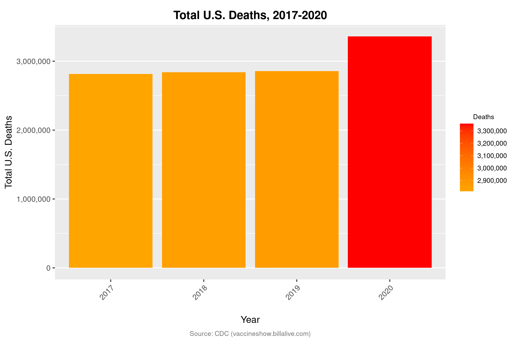
Total U.S. Deaths, All Causes#
The most plausible objection to these horrifying statistics is that many or most of these deaths weren’t really due to COVID-19. Maybe everyone who was sick and going to die anyway also happened to catch COVID-19 on the way out, thus inflating the tally.
As a hypothesis, this presumes a massive medical incompetence on a scale hitherto unseen in modern times. But it is technically possible… until you consider that the total death count, from all causes, rose just as we’d have expected in 2020.
data <- read_csv("data/total-usa-deaths.csv", show_col_types = FALSE)
title = "Total U.S. Deaths, 2017-2020"

ggplot(data, aes(x=reorder(Year, Deaths), y=Deaths, fill=Deaths)) +
  labs(
    title = title,
    caption = caption_default("CDC"),
    x="Year",
    y="Total U.S. Deaths"
  ) +
  bar_format(gradient_low=color_bar_gradient2, coord_flip=FALSE)
show_table(prep_table(data, title, col_number="Deaths") %>%
    gt_plt_bar(
        column = Deaths,
        keep_column = TRUE,
        color = ifelse(
                    str_detect(gt_index(., "Year"), "2020"),
                    color_bar, color_bar_gradient2)
    ))
| Total U.S. Deaths, 2017-2020 | ||
| Deaths | Year | Deaths |
|---|---|---|
| 2,813,503 | 2017 | |
| 2,839,205 | 2018 | |
| 2,854,838 | 2019 | |
| 3,357,814 | 2020 | |
Important
In 2020, 502,976 more Americans died overall than in 2019.
It’s one thing to imagine hundreds of thousands of deaths being misdiagnosed. But is it really conceivable that in 21st century America, half a million extra deaths could be faked?
Note that this total does not even include all 12 months of the first year of the pandemic, which means it excludes the devastating first two months of 2021.
Sources#
COVID-19 Deaths vs. Other Deaths in 2020#
This chart from the CDC separates the “ordinary” deaths in 2020 from the COVID-19 deaths.
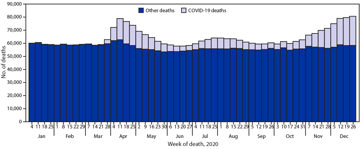
Fig. 2 CDC, Provisional Mortality Data — United States, 2020#
Do Only Old People Die of COVID-19?#
Given this high death toll, is it really true that the overwhelming majority of the casualties have been the most elderly?
Even if it were, the question has always struck me as awkward at best.
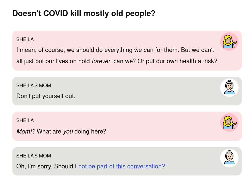
Fig. 3 Source: The Vaccine Show!#
But this whole way of framing the question might be a mistake.
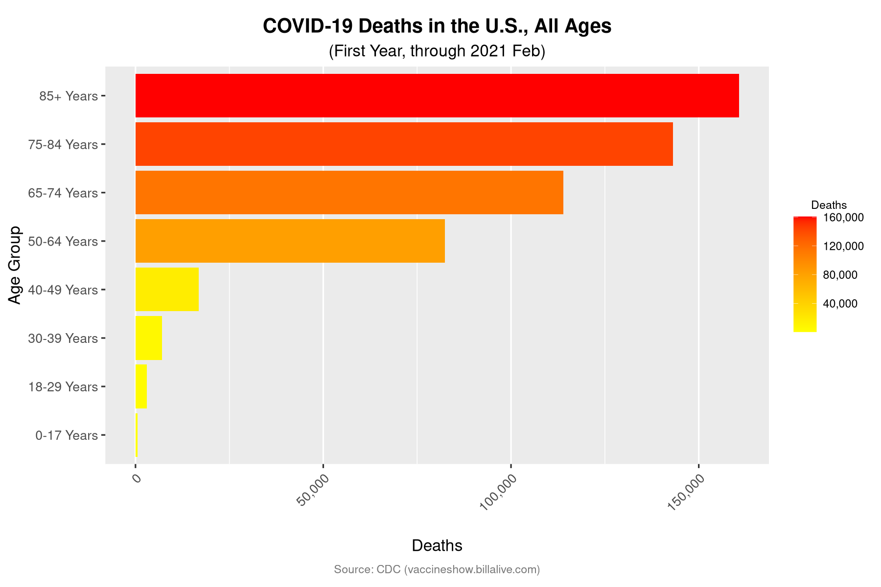
COVID-19 Deaths in the U.S.: All Ages#
All during the pandemic, one chart we have seen is something like this:
deaths_by_age = read_csv("data/deaths_by_age_group.csv",
                show_col_types = FALSE)
title = "COVID-19 Deaths in the U.S., All Ages"
subtitle = show_date_updated()

deaths_by_age %>%
ggplot(aes(x=reorder(Ages, sort(as.numeric(Age_Sort))), y=Deaths, fill=Deaths)) +
  labs(
    title = title,
    subtitle = subtitle,
    caption = caption_default("CDC"),
    x="Age Group",
    y="Deaths"
  ) +
    bar_format()
Important
Note that for this chart, and (almost) all charts dealing with age brackets, we are focusing only on COVID-19 deaths from the first year of the pandemic.
If we included all deaths up to know, these numbers would be much higher. But there’s a lag time before these breakdowns by age are available (see below).
The bars of this chart tell a simple, compelling story: if you’re 85 or over, COVID-19 is very dangerous, and then the younger you get, the less dangerous it is.
Is this true? Yes.
But just how dangerous is “less” dangerous?
For one thing, if there’s an “cliff” age where COVID-19 gets a lot more dangerous, I wouldn’t peg it at 85. I’d say more like… 50.
Change the Focus: Ages 50 to 85+#
Let’s focus only on the ages of 50 to 85+. In this chart, the difference between “middle-aged” and “old” seems considerably less stark.
Yes, the 85+ crowd is more than twice as likely to die from COVID-19. But we can also flip this: once you cross 50, you enter a cohort that’s only half as safe from COVID-19 as people three decades older.
deaths_by_age %>%
filter(str_detect(Ages, "^(50|65|75|85)" )) %>%
ggplot(aes(x=Ages, y=Deaths, fill=Deaths)) +
  labs(
    title = "COVID-19 Deaths in the U.S., Ages 50-85+",
    subtitle = subtitle,
    caption = caption_default("CDC"),
    x="Age Group",
    y="Deaths"
  ) +
bar_format(gradient_low="orange")
Imagine You Just Turned 50…#
Meanwhile, suppose our newly anxious 50-year-old casts a backward glance at the previous cohorts.
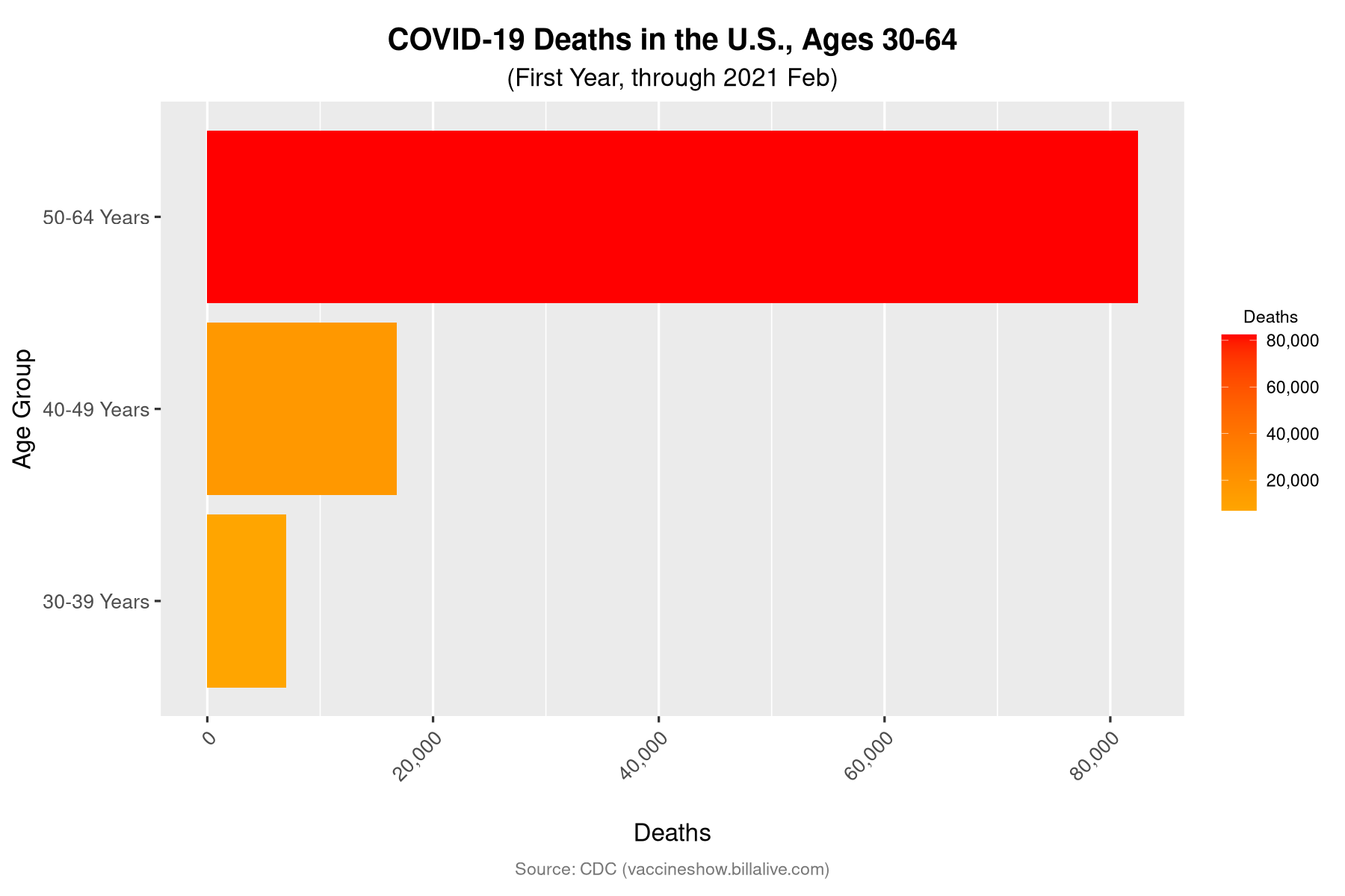
If we focus only on ages 30 to 64, turning 50 looks positively lethal.
deaths_by_age %>%
filter(str_detect(Ages, "^(30|40|50)" )) %>%
ggplot(aes(x=Ages, y=Deaths, fill=Deaths)) +
  labs(
    title = "COVID-19 Deaths in the U.S., Ages 30-64",
    subtitle = subtitle,
    caption = caption_default("CDC"),
    x="Age Group",
    y="Deaths"
  ) +
bar_format(gradient_low="orange")
Imagine if this were the chart we’d been seeing this whole time.
Or take it further. Imagine an alternate universe where people over 65 were suddenly safe from COVID-19. Even if the numerical death counts in all other age groups had stayed exactly the same, wouldn’t they have seemed so much more significant?
Of course, fortysomethings shouldn’t congratulate themselves too much. We can change the frame again.
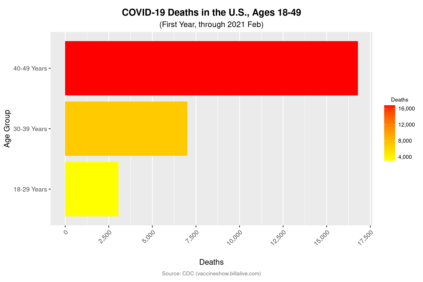
… Or You Just Turned 40…#
Turning 40 is never easy. But if we now imagine a pandemic that had spared everyone over 50… it’s even worse.
deaths_by_age %>%
filter(str_detect(Ages, "^(18|30|40)" )) %>%
ggplot(aes(x=Ages, y=Deaths, fill=Deaths)) +
  labs(
    title = "COVID-19 Deaths in the U.S., Ages 18-49",
    subtitle = subtitle,
    caption = caption_default("CDC"),
    x="Age Group",
    y="Deaths"
  ) +
 bar_format(scale_y_continuous=FALSE) +
scale_y_continuous(label=comma, breaks=seq(0,20000,by=2500))
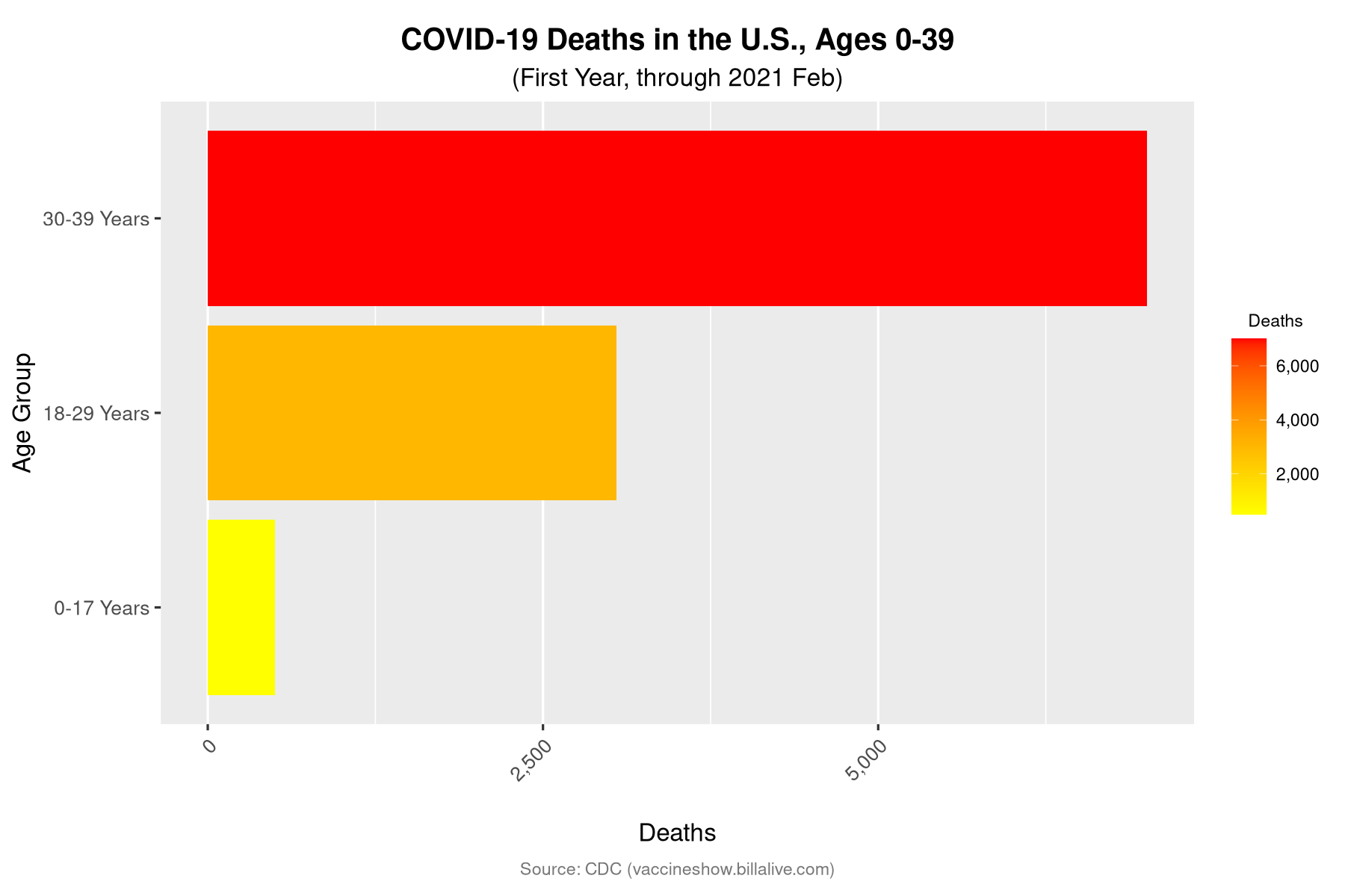
… Or You Just Turned 30…#
Change the frame once more, and turning 30 seems just as bad.
deaths_by_age %>%
  # Extract the first number from Ages so you can do a numeric sort.
mutate(Ages_Sort = str_extract(Ages, "^[0-9]+")) %>%
filter(str_detect(Ages, "^(0|5-|12|18|30)" )) %>%
ggplot(aes(x=reorder(Ages, sort(as.numeric(Ages_Sort))), y=Deaths, fill=Deaths)) +
  labs(
    title = "COVID-19 Deaths in the U.S., Ages 0-39",
    subtitle = subtitle,
    caption = caption_default("CDC"),
    x="Age Group",
    y="Deaths"
  ) +
    bar_format(scale_y_continuous=FALSE) +
    scale_y_continuous(label=comma, breaks=seq(0,20000,by=2500))
… Or You Just Turned 18.#
But even 30 has nothing on turning 18. What a jump…
deaths_by_age %>%
  # Extract the first number from Ages so you can do a numeric sort.
mutate(Ages_Sort = str_extract(Ages, "^[0-9]+")) %>%
filter(str_detect(Ages, "^(0|5-|12|18)" )) %>%
ggplot(aes(x=reorder(Ages, sort(as.numeric(Ages_Sort))), y=Deaths, fill=Deaths)) +
  labs(
    title = "COVID-19 Deaths in the U.S., Ages 0-29",
    subtitle = subtitle,
    caption = caption_default("CDC"),
    x="Age Group",
    y="Deaths"
  ) +
    bar_format(scale_y_continuous=FALSE) +
    scale_y_continuous(label=comma, breaks=seq(0,20000,by=500))
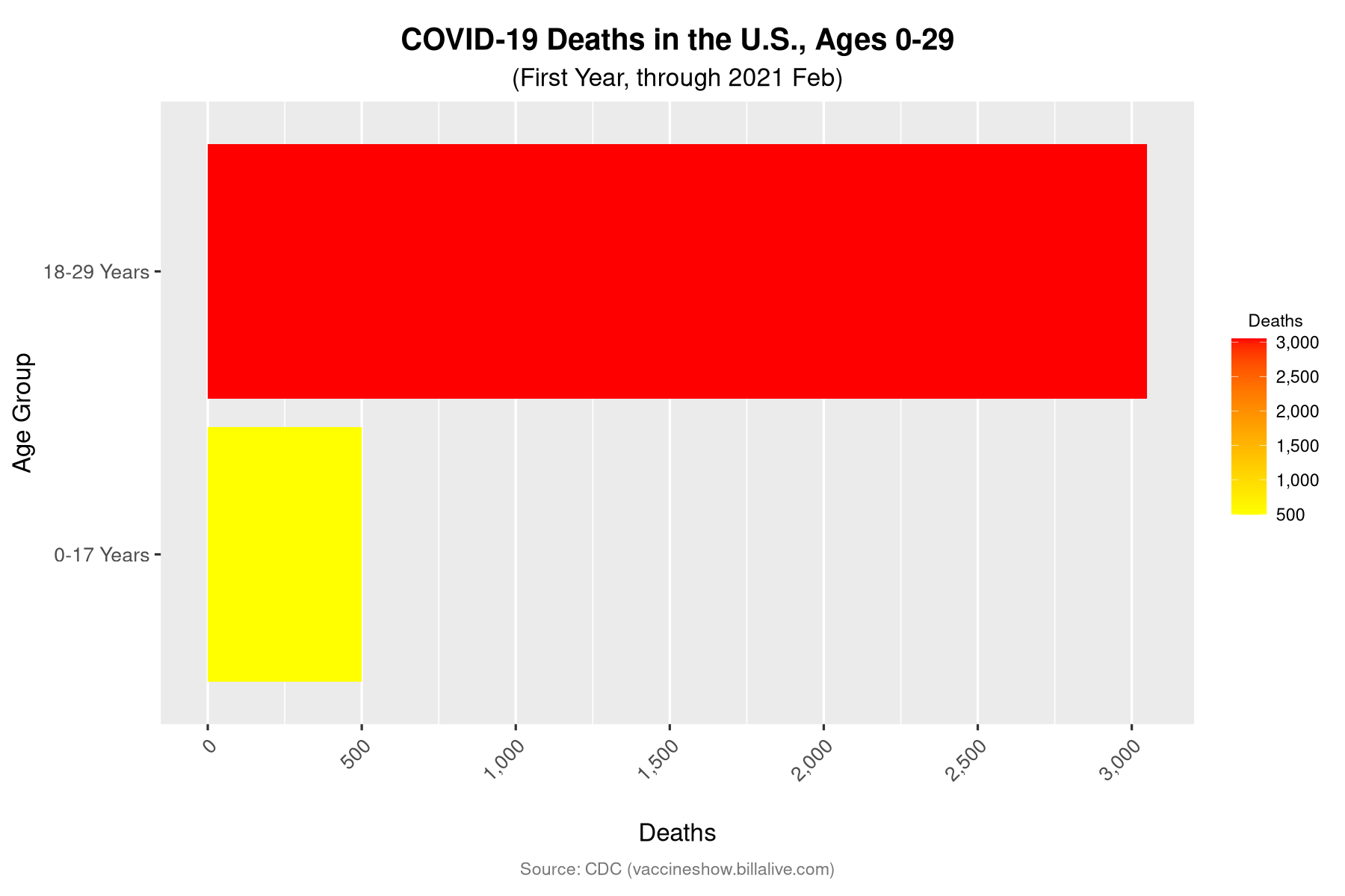
Of course, your actual risk doesn’t automatically zoom to your cohort maximum on your birthday. The point is that every new frame radically changes our sense of contrast, our sense of the relative risk depending on one’s age.
But What Do These Numbers Mean?#
Have you noticed a problem with all these comparisons?
The scale is always set by the highest number, the big red bar at the top.
It takes an effort to check the X axis and estimate the actual numbers involved.
Let’s look again at the deaths for all ages, but this time with the numbers easier to read.
title = "COVID-19 Deaths in the U.S., All Ages"
subtitle = show_date_updated()
show_table(prep_table(deaths_by_age %>% arrange(c(desc(Deaths))), title, subtitle=subtitle, col_number="Deaths") %>%
    tab_source_note(
        source_note = md("Source: CDC, [COVID Data Tracker](https://covid.cdc.gov/covid-data-tracker/#demographics)")
    ) %>%
    gt_plt_bar(column = Deaths, keep_column = TRUE, color = color_bar))
| COVID-19 Deaths in the U.S., All Ages | |||
| (First Year, through 2021 Feb) | |||
| Age_Sort | Ages | Deaths | Deaths |
|---|---|---|---|
| 85 | 85+ Years | 160,704 | |
| 75 | 75-84 Years | 143,143 | |
| 65 | 65-74 Years | 113,977 | |
| 50 | 50-64 Years | 82,424 | |
| 40 | 40-49 Years | 16,783 | |
| 30 | 30-39 Years | 7,006 | |
| 18 | 18-29 Years | 3,050 | |
| 16 | 0-17 Years | 500 | |
| Source: CDC, COVID Data Tracker | |||
Does this help?
If you have an instant reference point for numbers like “82,424” or “16,783”, perhaps these numbers are more meaningful than simple bars. If not, it’s hard not to slide back into comparing all the bars to the biggest.
COVID Has Killed More Americans Ages 50-64 Than Live in These Cities#
You might have seen comparisons of the total COVID-19 death toll to the populations of various cities.
I find this helpful… but not if my mind instantly adds, “and most of those were the elderly”.
What if we make this comparison only to the death toll for a particular age group?
data <- read_csv("data/covid-deaths-vs-cities-50-64-first-year.csv", show_col_types = FALSE)
title = "In its first year, COVID-19 Killed More Americans Aged 50 to 64 Than the Populations of These Cities"
subtitle = paste("COVID-19 Deaths", show_date_updated(), "vs. City Populations from 2020")

show_table(prep_table(data %>% arrange(c(desc(Population))),
                      title, subtitle=subtitle, col_number="Population") %>%
    gt_highlight_rows(rows = 1, fill = color_covid_row) %>%
    gt_plt_bar(
        column = Population,
        keep_column = TRUE,
        color = ifelse(str_detect(gt_index(., City), covid_match_str),
                       color_bar, "gray")
    ))
| In its first year, COVID-19 Killed More Americans Aged 50 to 64 Than the Populations of These Cities | ||
| COVID-19 Deaths (First Year, through 2021 Feb) vs. City Populations from 2020 | ||
| City | Population | Population |
|---|---|---|
| COVID-19 Deaths (Ages 50-64) | 82,424 | |
| Flint, MI | 81,252 | |
| Parma, OH | 81,146 | |
| Somerville, MA | 81,045 | |
| Hammond, IN | 77,879 | |
| Scranton, PA | 76,328 | |
| St. Joseph, MO | 72,473 | |
| Camden, NJ | 71,791 | |
| Wilmington, DE | 70,898 | |
| Canton, OH | 70,872 | |
| Gary, IN | 69,093 | |
| Utica, NY | 65,283 | |
| Youngstown, OH | 60,068 | |
Again, this is only deaths for Americans between 50 and 64. And only for the first 12 months of the pandemic.
Does this still seem like a disease that’s only killing “old people”?
What about the current status? As of 2022 September, the updated death toll for ages 50 to 64, out of 903,826 COVID-19 deaths with demographic information, is now 162,045.
covid_deaths_with_demographic_info = "903,826"
data <- read_csv("data/covid-deaths-vs-cities-50-64-current.csv", show_col_types = FALSE)
title = "By Now, COVID-19 Has Killed More Americans Aged 50 to 64 Than the Populations of These Cities"
subtitle = paste("COVID-19 Deaths (out of ", covid_deaths_with_demographic_info , ") vs. City Populations from 2020")

show_table(prep_table(data %>% arrange(c(desc(Population))),
                      title, subtitle=subtitle, col_number="Population") %>%
    gt_highlight_rows(rows = 1, fill = color_covid_row) %>%
    gt_plt_bar(
        column = Population,
        keep_column = TRUE,
        color = ifelse(str_detect(gt_index(., City), covid_match_str),
                        color_bar, "gray")
    ))
| By Now, COVID-19 Has Killed More Americans Aged 50 to 64 Than the Populations of These Cities | ||
| COVID-19 Deaths (out of 903,826 ) vs. City Populations from 2020 | ||
| City | Population | Population |
|---|---|---|
| COVID-19 Deaths (Ages 50-64) | 162,045 | |
| Paterson, NJ | 159,732 | |
| Alexandria, VA | 159,467 | |
| Macon, GA | 157,346 | |
| Corona, CA | 157,136 | |
| Kansas City, KS | 156,607 | |
| Lakewood, CO | 155,984 | |
| Springfield, MA | 155,929 | |
| Sunnyvale, CA | 155,805 | |
| Jackson, MS | 153,701 | |
| Killeen, TX | 153,095 | |
| Hollywood, FL | 153,067 | |
| Murfreesboro, TN | 152,769 | |
| Pasadena, TX | 151,950 | |
| Bellevue, WA | 151,854 | |
| Pomona, CA | 151,713 | |
| Escondido, CA | 151,038 | |
| Joliet, IL | 150,362 | |
| Charleston, SC | 150,227 | |
| Mesquite, TX | 150,108 | |
| Naperville, IL | 149,540 | |
| Rockford, IL | 148,655 | |
| Bridgeport, CT | 148,654 | |
| Syracuse, NY | 148,620 | |
| Savannah, GA | 147,780 | |
Note
Why is the total number of COVID-19 deaths in this chart’s subtitle about 100,000 less than the most-up-to-date total of over 1 million? Because there is a lag time before full demographic data is available. So in reality, the total number of COVID-19 deaths in this age group may be 200,000 or more.
Sources#
CDC, Demographic Trends of COVID-19 cases and deaths in the US reported to CDC (Most recently accessed: 2022-09-20.)
Wikipedia, List of United States Cities by Population
COVID-19 (First Year) vs. Other Leading Causes of Death (2019)#
Although comparing the death toll to an entire city population is a stark image, it doesn’t really help us make sense of the relative risk.
Let’s compare the first year of COVID-19 deaths to the leading causes of death in the previous year, 2019.
The CDC did try to publicize that, overall, COVID-19 was the third leading cause of death in 2020.
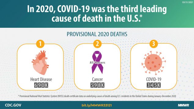
Fig. 4 CDC, Provisional Mortality Data — United States, 2020#
But without more data, we might be inclined to assume that this was still weighted heavily by the extremely high death tolls among the most elderly.
Let’s compare COVID-19 deaths to other leading causes by age bracket.
Why Use 2019 Death Data instead of 2020 or 2021 Death Data?#
We all entered the pandemic with a mental map of what “normal” risks were. The pandemic had side effects on some of these risks (such as accidents and suicides), so I want to see how our last “normal” year compared to the first 12 months of COVID-19.
See also
You can research causes of death further with the CDC Wonder database.
Note that, as of 2022 September, there is still no data available yet for 2021. For COVID-19 deaths, I have relied on the CDC Covid Data Tracker, which is much more up-to-date.
Ages 1-19#
The one real mercy of the pandemic: compared to other age brackets, the death rate for children and teenagers has been comparatively low.
Everyone seems to “know” this already, but when we compare it to other leading causes of death for these ages, it does turn out to be true.
Yes, COVID-19 still ranked in a grim seventh place, but the other causes of death were far more likely.
Not that those other causes are consoling. I had no idea the numbers for suicide and murder were this high.
Note
This comparison is not perfect, because the age brackets for the leading causes of death (1-19) do not match up perfectly with the age brackets for COVID-19 deaths (0-17). When full demographic data for 2021 is available, I can update this chart.
I also excluded babies younger than 1 from this chart, because they have unique early causes of death that would don’t apply to older children. Certain conditions originating in the perinatal period killed 10,294 babies in 2019, and this would dominate the chart in the top rank.
data <- read_csv("data/covid-deaths-vs-other-age-01-19.csv", show_col_types = FALSE)
title = title_ages_vs_leading_cause("1-19")
subtitle = paste("COVID-19 Deaths for Ages 0-17", show_date_updated(), "vs. Other Causes of Death for ages 1-19 (in 2019)")
show_table_covid_vs_other(data, "Cause")
| Ages 1-19: Causes of Death | ||
| COVID-19 Deaths for Ages 0-17 (First Year, through 2021 Feb) vs. Other Causes of Death for ages 1-19 (in 2019) | ||
| Cause | Deaths | Deaths |
|---|---|---|
| Accidents | 6,178 | |
| Suicide | 2,756 | |
| Murder | 2,507 | |
| Cancer | 1,649 | |
| Birth defects | 985 | |
| Heart disease | 599 | |
| COVID-19 (0-17 year-olds, see note) | 500 | |
| Influenza and pneumonia | 316 | |
| Chronic lower respiratory diseases | 247 | |
Ages 20-29#
As we cross into the 20s, COVID-19 has already jumped into fourth place.
True, COVID-19 deaths are still dwarfed by the top cause, accidents, and well below suicides and murders.
Still, for people in their twenties during the unvaccinated first year of the pandemic, COVID-19 was more deadly than any other disease.
data <- read_csv("data/covid-deaths-vs-other-age-20-29.csv", show_col_types = FALSE)
title = title_ages_vs_leading_cause("20-29")
subtitle = paste("COVID-19 Deaths for Ages 18-29",
                 show_date_updated(),
                 "vs. Other Causes of Death for ages 18-29 (in 2019)")
show_table_covid_vs_other(data, "Cause")
| Ages 20-29: Causes of Death | ||
| COVID-19 Deaths for Ages 18-29 (First Year, through 2021 Feb) vs. Other Causes of Death for ages 18-29 (in 2019) | ||
| Cause | Deaths | Deaths |
|---|---|---|
| Accidents | 20,064 | |
| Suicide | 7,773 | |
| Murder | 5,802 | |
| COVID-19 (18-29 year-olds, see note) | 3,050 | |
| Cancer | 2,148 | |
| Heart diseases | 1,806 | |
| Diabetes | 525 | |
| Birth Defects | 379 | |
| Pregnancy and Childbirth | 358 | |
| Liver disease, cirrhosis | 301 | |
Note
This comparison is not perfect, because the age brackets for the leading causes of death (20-29) do not match up perfectly with the age brackets for COVID-19 deaths (18-29). But even if we excluded the 18- and 19-year-olds, this would have to remove at least a third of the total deaths (about 900) in order to change the ranking. Which seems unlikely.
Ages 30-39#
The good news as we enter our 30s: murder is no longer in the top three ways to die.
The bad news: COVID-19 is, at third place, quite close to suicide.
data <- read_csv("data/covid-deaths-vs-other-age-30-39.csv", show_col_types = FALSE)
title = title_ages_vs_leading_cause("30-39")
subtitle = paste("COVID-19 Deaths", show_date_updated(), "vs. Other Causes of Death (in 2019)")
show_table_covid_vs_other(data, "Cause")
| Ages 30-39: Causes of Death | ||
| COVID-19 Deaths (First Year, through 2021 Feb) vs. Other Causes of Death (in 2019) | ||
| Cause | Deaths | Deaths |
|---|---|---|
| Accidents | 22,676 | |
| Suicide | 7,984 | |
| COVID-19 | 7,006 | |
| Cancer | 6,347 | |
| Heart disease | 6,169 | |
| Murder | 4,349 | |
| Liver disease, cirrhosis | 2,292 | |
| Diabetes | 1,404 | |
| Cerebrovascular (e.g. stroke) | 1,034 | |
Ages 40-49#
About as many people in their 40s committed suicide as in their 30s, but now many more people died of cancer, heart disease… and COVID-19, at fourth place.
data <- read_csv("data/covid-deaths-vs-other-age-40-49.csv", show_col_types = FALSE)
title = title_ages_vs_leading_cause("40-49")
subtitle = paste("COVID-19 Deaths", show_date_updated(), "vs. Other Causes of Death (in 2019)")
show_table_covid_vs_other(data, "Cause")
| Ages 40-49: Causes of Death | ||
| COVID-19 Deaths (First Year, through 2021 Feb) vs. Other Causes of Death (in 2019) | ||
| Cause | Deaths | Deaths |
|---|---|---|
| Accidents | 22,184 | |
| Cancer | 19,120 | |
| Heart disease | 18,072 | |
| COVID-19 | 16,783 | |
| Suicide | 7,587 | |
| Liver disease, cirrhosis | 5,139 | |
| Diabetes | 3,757 | |
| Cerebrovascular (e.g. stroke) | 3,103 | |
| Murder | 2,683 | |
| CLRD (e.g. from smoking) | 1,424 | |
Ages 50-64#
From here on out, COVID-19 will be keeping pace with cancer and heart disease as all three mushroom in victim count.
data <- read_csv("data/covid-deaths-vs-other-age-50-64.csv", show_col_types = FALSE)
title = title_ages_vs_leading_cause("50-64")
subtitle = paste("COVID-19 Deaths", show_date_updated(), "vs. Other Causes of Death (in 2019)")
show_table_covid_vs_other(data, "Cause")
| Ages 50-64: Causes of Death | ||
| COVID-19 Deaths (First Year, through 2021 Feb) vs. Other Causes of Death (in 2019) | ||
| Cause | Deaths | Deaths |
|---|---|---|
| Cancer | 134,808 | |
| Heart disease | 100,506 | |
| COVID-19 | 82,424 | |
| Accidents | 37,131 | |
| CLRD (e.g. from smoking) | 21,307 | |
| Diabetes | 19,474 | |
| Liver disease, cirrhosis | 19,311 | |
| Cerebrovascular (e.g. stroke) | 16,072 | |
| Suicide | 12,234 | |
| Kidney disease | 7,265 | |
Ages 65-74#
data <- read_csv("data/covid-deaths-vs-other-age-65-74.csv", show_col_types = FALSE)
title = title_ages_vs_leading_cause("65-74")
subtitle = paste("COVID-19 Deaths", show_date_updated(), "vs. Other Causes of Death (in 2019)")
show_table_covid_vs_other(data, "Cause")
| Ages 65-74: Causes of Death | ||
| COVID-19 Deaths (First Year, through 2021 Feb) vs. Other Causes of Death (in 2019) | ||
| Cause | Deaths | Deaths |
|---|---|---|
| Cancer | 171,062 | |
| Heart disease | 122,421 | |
| COVID-19 | 113,977 | |
| CLRD (e.g. from smoking) | 39,238 | |
| Cerebrovascular (e.g. stroke) | 24,051 | |
| Diabetes | 23,069 | |
| Accidents | 17,163 | |
| Kidney disease | 10,938 | |
| Liver disease, cirrhosis | 10,411 | |
| Septicemia | 8,810 | |
Ages 75-84#
data <- read_csv("data/covid-deaths-vs-other-age-75-84.csv", show_col_types = FALSE)
title = title_ages_vs_leading_cause("75-84")
subtitle = paste("COVID-19 Deaths", show_date_updated(), "vs. Other Causes of Death (in 2019)")
show_table_covid_vs_other(data, "Cause")
| Ages 75-84: Causes of Death | ||
| COVID-19 Deaths (First Year, through 2021 Feb) vs. Other Causes of Death (in 2019) | ||
| Cause | Deaths | Deaths |
|---|---|---|
| Cancer | 160,639 | |
| Heart disease | 158,287 | |
| COVID-19 | 143,143 | |
| CLRD (e.g. from smoking) | 50,791 | |
| Cerebrovascular (e.g. stroke) | 40,592 | |
| Alzheimer disease | 33,566 | |
| Diabetes mellitus | 22,185 | |
| Accidents | 18,438 | |
| Parkinson disease | 14,902 | |
| Kidney disease | 14,720 | |
Ages 85+#
data <- read_csv("data/covid-deaths-vs-other-age-85-plus.csv", show_col_types = FALSE)
title = title_ages_vs_leading_cause("85+")
subtitle = paste("COVID-19 Deaths", show_date_updated(), "vs. Other Causes of Death (in 2019)")
show_table_covid_vs_other(data, "Cause")
| Ages 85+: Causes of Death | ||
| COVID-19 Deaths (First Year, through 2021 Feb) vs. Other Causes of Death (in 2019) | ||
| Cause | Deaths | Deaths |
|---|---|---|
| Heart disease | 250,875 | |
| COVID-19 | 160,704 | |
| Cancer | 103,761 | |
| Alzheimer disease | 78,688 | |
| Cerebrovascular (e.g. stroke) | 64,550 | |
| CLRD (e.g. from smoking) | 43,217 | |
| Accidents | 24,926 | |
| Influenza and pneumonia | 19,464 | |
| Diabetes | 17,143 | |
| Kidney disease | 16,572 | |
Sources#
Leading Causes of U.S. Death in 2019 (CDC WONDER): Ages 1-19, Ages 20-29, Ages 30-39, Ages 40-49, Ages 50-64, Ages 65-74, Ages 75-84, Ages 85+
Summary#
Is COVID-19 “mostly” a disease for “old people”?
No. In the first year of the pandemic, COVID-19 was the third or fourth leading cause of death for adults of all ages.
True, the sheer number of deaths grew rapidly with age.
But imagine if any single age bracket had been the only target of the disease. What if only people in their thirties, or only people in their fifties, had suddenly faced a new disease that, within one year, was the third leading cause of death for their age? How would we have viewed these death tolls?
Important
We don’t see cancer or heart disease as afflicting “mostly” the old, much less diabetes, murder, or suicide. Why should COVID-19 be different?
For unvaccinated adults at any age, the risks of COVID-19 should be understood in the context of any other leading cause of death for their age group.
I hope this report has suggested a fresh view of the COVID-19 data.
When mortality data is available for 2021, I plan to write an updated report that explores how the vaccines have drastically lowered the risks for those who take them, and whether the risk of death has changed for those who don’t.
See also
For a more in-depth exploration that engages more fully with hesitations about the vaccine (and whether this data can be trusted at all), see The Vaccine Show!
Appendix: Important Caveats#
This report is, alas, far from perfect. Several reasons spring to mind.
Focus on the United States#
As an American writing for Americans, I have focused entirely on data from the United States.
My point here is to consider COVID-19 in the context of our specific cultural expectations about risk, safety, and life expectancy here in the U.S. If I had brought in data from the rest of the world, with its wildly differing approaches to COVID-19 countermeasures and health care systems, these comparisons would have been hopelessly muddled.
Why Focus on the “First Year” Of COVID-19?#
COVID-19 has not been like other causes of death. Unlike car accidents or cancer, COVID-19 is contagious. So how can we compare this death toll to ordinary causes of death that don’t have the potential for exponential growth?
How Many Months of COVID Deaths Should We Compare to a Year of Ordinary Mortality Data?#
When I first gathered this data in 2021 September, the CDC graph of cumulative deaths from COVID-19 showed a trend line that was very much not straight:
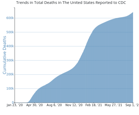
Fig. 5 Source: CDC, Trends in Number of COVID-19 Cases and Deaths in the US Reported to CDC, by State/Territory, 2021 September#
As I wrote then, in The Vaccine Show:
You can see it spike at first in April 2020, slow down as we started masks and lockdowns, pick up speed in August, devastate over the winter, finally taper off in spring of 2021 as we got the vaccines… and then spike again in late summmer, as Delta hit.
As of September 2021, it’s too early to tell how this Delta phase will go.
Yes, it was. Not long after, we’d hear about Omicron.
As of now, 2022 September, here is that chart, updated.
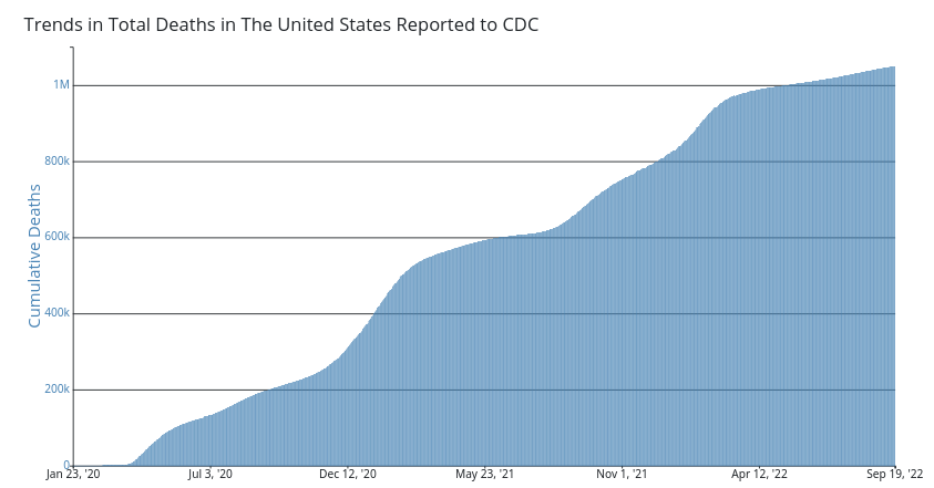
Fig. 6 Source: CDC, Trends in Number of COVID-19 Cases and Deaths in the US Reported to CDC, by State/Territory, 2022 September#
The trend line hasn’t gotten any more predictable.
Meanwhile, ordinary mortality data is broken up by year. Is it really fair to compare a year of a pandemic, the first year of a contagious disease, to an ordinary year of deaths?
Despite the obvious potential problems, I decided to go ahead and stick to those first twelve months. My audience here is not statisticians, but ordinary people trying to make sense of an ocean of data. It seems most “fair” to compare twelve months of COVID to twelve months of everything else.
The First Year Of COVID-19 Had No Vaccines#
Another reason to focus only on the first twelve months of COVID-19 deaths: February just happened to be around the time when the vaccines were rolled out in the United States.
As the above chart shows, the death rate clearly slowed as the vaccines were introduced. But how much of this was due directly to vaccines? It would be months before the data would be available on what percentage of the continuing deaths were among the vaccinated vs. the unvaccinated. By limiting my comparisons to the first twelve months of the pandemic, I could avoid that question, which, in 2021 September, could not yet be answered.
To Which Year Should We Compare Causes of Death?#
Even though I decided to compare twelve months of COVID deaths to twelve months of other causes of death, another question was, which twelve months? 2020 was no ordinary year. The pandemic had a direct impact on other causes of death. Car accidents were down, but suicides were up.
I decided to compare ordinary causes of death from the previous year, 2019. This isn’t perfect, but it’s the closest we can get to a fair comparison to the old “normal”.
What About Long COVID?#
This report focuses entirely on the risk of death from COVID-19.
But for most of these pandemic, we’ve known that for most of us, the far more likely outcome is “long COVID”, a nebulous purgatory that, even now, seems disgracefully understudied.
A true risk comparison between the risk of the vaccines vs. the risk of COVID-19 would be heavily weighted by your chances suffering long COVID symptoms, possibly for the rest of your life.
But I have not been able to find data on long COVID that seems truly authoritative. Every significant new study gives a different set of numbers.
For now, the best I can do is flag this issue. The odds of dying are already stark enough, but long COVID is far more likely.
What About the Risks From the Vaccines?#
With all these risks compared, one risk is glaringly absent in this report: the risk from the vaccines themselves.
When I originally worked on The Vaccine Show! in mid-2021, I was not aware of a single death that could be reliably attributed to the new vaccines.
As of 2022 September, the CDC has an entire page devoted to “adverse events” associated with the COVID-19 vaccines. But these events are exceedingly rare, on the order of literally 1 in a million. (The highest rate I can find is 106 cases of myocarditis in 16-17 year old males… per one million doses.)
These events are not only incredibly unlikely, but not fatal. They could be meaningfully compared with long COVID, but as we’ve seen, that data is not yet available.
For our purposes, the relevant question is: have there been any actual deaths that can be causally linked to the COVID-19 vaccines?
The answer: Yes.
Nine.
Or… up to 16,000+?
Apparently, it’s complicated. Here’s the CDC:
Reports of death after COVID-19 vaccination are rare. FDA requires healthcare providers to report any death after COVID-19 vaccination to VAERS, even if it’s unclear whether the vaccine was the cause. Reports of adverse events to VAERS following vaccination, including deaths, do not necessarily mean that a vaccine caused a health problem. More than 610 million doses of COVID-19 vaccines were administered in the United States from December 14, 2020, through September 7, 2022. During this time, VAERS received 16,336 preliminary reports of death (0.0027%) (emphasis added) among people who received a COVID-19 vaccine. CDC and FDA clinicians review reports of death to VAERS including death certificates, autopsy, and medical records.
Continued monitoring has identified nine deaths (emphasis added) causally associated with J&J/Janssen COVID-19 vaccination. CDC and FDA continue to review reports of death following COVID-19 vaccination and update information as it becomes available.
Honestly, I wish this language were more clear. Does this mean that out of all those reports, only nine are confirmed?
What percentage of the 16,000+ reported deaths should we take to be actually due to a vaccine shot? Is this probably more like 8,000? Or 80?
And where is the demographic data on these deaths? Do they follow the same age distribution as COVID-19 deaths?
Important
Remember: unlike a coroner’s report, anyone can submit a VAERS report.
Maximum Conceivable Deaths from Vaccine vs. Confirmed Deaths From COVID-19#
But let’s take the worst-case scenario. Suppose that every single one of those deaths were directly caused by the vaccine. Here’s what that looks like next to the COVID death toll:
library(tibble)
vaccine_deaths <- 16336

gt_table <- enframe(c(
    "Maximum Conceivable Deaths From COVID-19 Vaccines" = vaccine_deaths,
    "Confirmed Deaths From COVID-19" = covid_deaths_updated_num),
    name = "Cause",
    value = "Deaths") %>%
gt() %>%
gt_theme_538() %>%
tab_header(
    title = "VAERS Reported Deaths Possibly Related to COVID-19 Vaccines vs. COVID-19 Deaths in the U.S.",
    subtitle = show_date_updated(use_date_updated=TRUE)
    ) %>%
tab_source_note(
    source_note = md("Source: CDC, [Selected Adverse Events Reported after COVID-19 Vaccination](https://www.cdc.gov/coronavirus/2019-ncov/vaccines/safety/adverse-events.html)")
    ) %>%
gt_plt_bar(
    column = Deaths,
    keep_column = TRUE,
    color = 'red'
) %>%
fmt_number(
    columns = Deaths,
    decimals = 0
    )

gt:::as.tags.gt_tbl(gt_table)
| VAERS Reported Deaths Possibly Related to COVID-19 Vaccines vs. COVID-19 Deaths in the U.S. | ||
| (through 2022 Sep) | ||
| Cause | Deaths | Deaths |
|---|---|---|
| Maximum Conceivable Deaths From COVID-19 Vaccines | 16,336 | |
| Confirmed Deaths From COVID-19 | 1,048,935 | |
| Source: CDC, Selected Adverse Events Reported after COVID-19 Vaccination | ||
Even if every preliminary VAERS-reported death were actually directly due to the vaccine, COVID would still be more than 64 times more likely to kill you.
Since we cannot escape facing the risk of COVID-19, the choice to risk the vaccine would still be extremely rational.
But this comparison is probably spurious.
These are preliminary reports, not confirmed deaths due to the vaccine. Actual deaths due to the vaccine could easily be orders of magnitude lower.
In a future update to this report, if I can get reliable demographic data for deaths that are confirmed as due to the COVID-19 vaccines, I will include them in the charts comparing COVID-19 to other leading causes of death.
Haven’t Vaccines Drastically Changed These Odds?#
The final objection to these charts may also the most obvious: don’t we have vaccines now? What is the relevance of a series of charts that focus on COVID-19 risks before we had widespread vaccination?
Because the death toll continues.
Yes, this notebook focuses on COVID-19 deaths for the first year of the pandemic. The official COVID-19 death toll in the United States, per the CDC, was 527,587 Americans dead through 2021 February.
Back then, we could still remember a time when that number was supposed to be unthinkable, when the most pessimistic estimates were on the order of, say, 200,000.
But in the intervening year and a half, almost another 500,000 Americans have died.
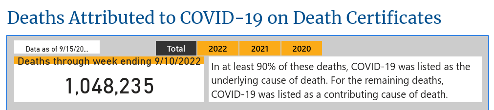
As I write this now, in mid-September 2022, the CDC gives a death toll of 1,048,935.
In the news, that million-death milestone has already come and gone. It’s still obscene.
So yes, for those who are vaccinated, these charts are now mercifully out of date.
But for the unvaccinated, it is not all obvious that the relative risk of dying from COVID-19 is less than it was a year ago.
On the positive side:
As our immunity grows, both from vaccinations and nonfatal cases of COVID-19, that means less virus circulating to infect the unvaccinated.
We now have much improved treatments to reduce the risk of death.
But on the negative side:
Newer variants are far more contagious than the original strain.
The unvaccinated often move in social circles with other friends and family who also refuse vaccines.
If you’re still not vaccinated, even if you’ve had a “mild” case of COVID-19 already, your risk of death may still be higher now than it’s ever been. The death toll continues, and the vast majority of deaths are among the unvaccinated.
As new data becomes available, I plan on releasing a new report that makes these same risk comparisons to other causes of death, but adjusted for the unvaccinated vs. the vaccinated.
For now, the charts above are still relevant and, if anything, optimistic, for those who want to get a better idea of their risk of dying from COVID-19 if they decline the protection of vaccines.
print(paste("Last updated:", date_updated))
[1] "Last updated: through 2022 Sep"